La Tasca Flamenca
Website Redesign
Company La Tasca Flamenca
Duration 7/24/23 – Present
Role Webmaster & Developer
Link latascaflamenca.com
Project Overview
Problems
- The old website looked outdated
- Visually unappealing and hard to navigate which created a negative user experience and contributed to high drop-off rates
- The website content was only in German, which narrowed down the potential customer base
- There was only one image of food on the homepage, which was very text heavy
- No graphic design resources or staff
Project Details
Design Goal
To improve the user experience of the website, add new important sections, make improvements to create a seamless user flow, display content in multiple languages, create a visually appealing and responsive design that is mobile friendly, and encourage customers to make a reservation, place a catering order, book an event or purchase gift cards.
Target Users
Located in important cities throughout Germany and Spain, La Tasca restaurant is visited by both locals and tourists drawn to Spanish cuisine. Local audiences speak German, Spanish, and English. They are typically busier during office hours (visited by professionals during their lunch time) and weekends (visited by couples and families). They also host large business events and tourists that do not speak the local language and rely on Instagram and the website to order through pictures.
Design Criteria
Quality and feel – Traditional Spanish style yet modern, food-centric, use of company brand colors.
Ease of use – Important information needs to be easily accessible with an intuitive and smooth user flow.
Sitemap
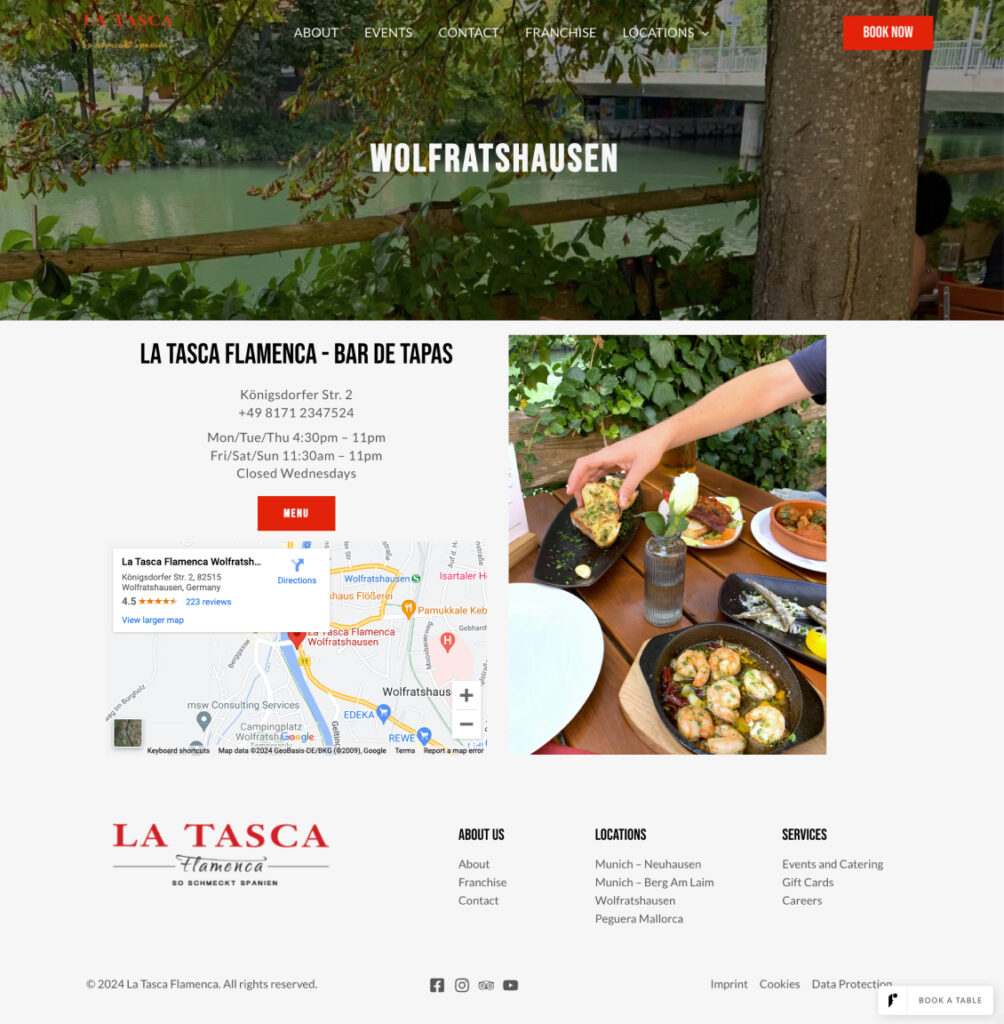
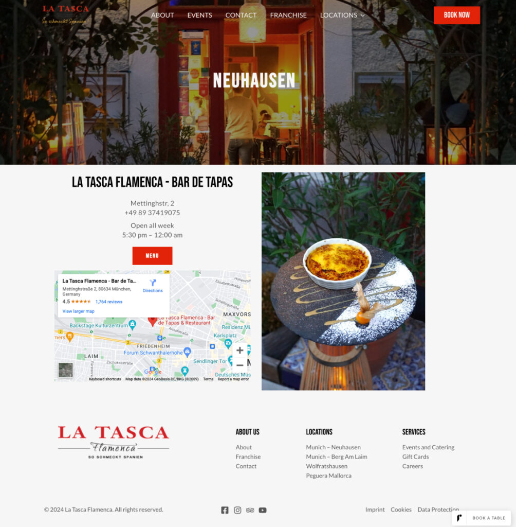
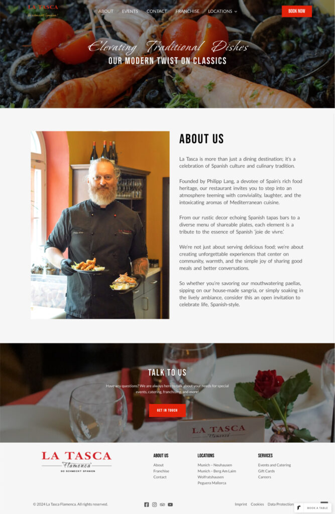
For this project, new content pages such as the franchise page, contact page, careers page, about us page, etc. had to be designed and implemented. Each page was designed to have its own independent flow and be available in three different languages. The sitemap below helped organize the order of these pages and the relations between them.
UX Redesign
The original website lacked both aesthetic visual design and positive user experience. The issues with the user experience were:
- Primary interactions are not prioritized
- Not enough pictures of food on the homepage for a restaurant website
- Navigation between pages is difficult
- “Book a table” button is small and blends in with the background
- Location information sprinkled throughout the page making it difficult for the user to view
- The typography and layout are not consistent throughout the page and they don’t match the corporate branding
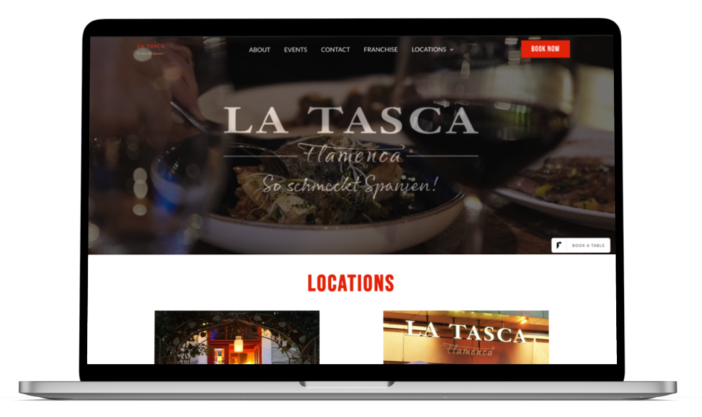
After going over the issues with my client, I mocked up design solutions for each page. Below is a comparison comparing the original homepage and the redesigned version.
Visual Design
In addition to redesigning the user experience and the original pages of the website, the client also needed new pages for different parts of the business: Franchise, Contact, Careers, etc.
The new visual design for the new and the original pages follows the characteristics of the brand. It aims to give users a sense of warmth, culture, and liveliness. All pages use a consistent design system with a slightly different touch of visual treatment to keep their individuality.
The new Franchise page, for example, is an exciting page that invites customers to join the La Tasca Flamenca family. On this page, customers can learn more about the benefits of joining the franchise family, fill out an interest form, and get excited by watching an engaging video featuring delicious food, an amazing atmosphere, and the restaurant culture.
Style / Design Systems
To ensure the components are implemented consistently across the site, I created a UI guide with details on color palettes, typography, and reusable UI elements.
Final Takeaways
The mobile first approach is the quickest and most effective way to create responsive pages.
Strong communication with the client is important and goes a long way when designing a product.
Chunking out the work as pieces of a larger puzzle made it more digestible. This allowed me to focus on small milestones until reaching the finish line.